
Familiar – 14
Feb05
on February 5, 2015
at 5:38 am
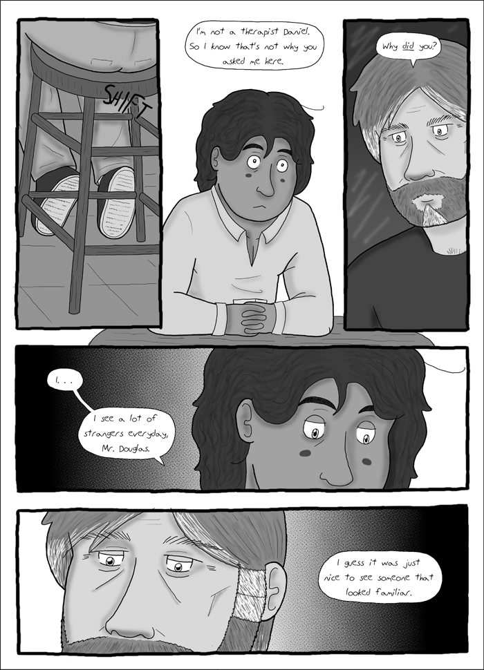
[Edit: Here’s the unshaded version of Page 14. Moving forward I think I’m gonna stick with this style. I liked the way the shading looked, but I’m not sure if it’s right for this comic. I’m still kind of undecided though, to be honest! You can see the shaded version here, if you’re interested.]
titledrop.png
You may have noticed this page is looking a little different from the rest. A little more shady, perhaps? I’m sure it’s a little jarring, but hopefully it looks a little better? Maybe? If you’re curious, there’s an unshaded version here for comparison. I dunno, what do you guys think? Better? Worse? Irrelevant?
Shaded or unshaded it still looks good. It’s your comic, how it looks is up to you. 🙂
Thanks, I appreciate it! I wish I wasn’t so indecisive, but I tend to obsess over these things.